All kinds

you have come to the right place to achive many kainds of Sofwares. more »

ultimate Games

Awsome free games full version, that makes you great experience. more »

solutions for you

here we supports to solve you 'r problems. more »

Relax

relax with music, that is from recent times. more »
Showing posts with label ps. Show all posts

Create a Sports-Themed Text Effect in Photoshop Using Layer Styles

by Infamous_son

Final Product What You'll Be Creating

In this quick tutorial we will show you how to create sports-themed text effect using layer styles in Photoshop. Let’s get started!


Tutorial Assets

The following assets were used during the production of this tutorial.

Step 1

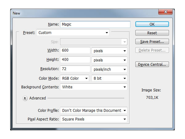
Preparing assets and creating document. First create a new .PSD document, 600 x 400 pixels in RGB mode, 72 DPI with any background color. Now prepare your assets. Install the SF Sports Night fonts into your computer and open .PAT file.
Step 2

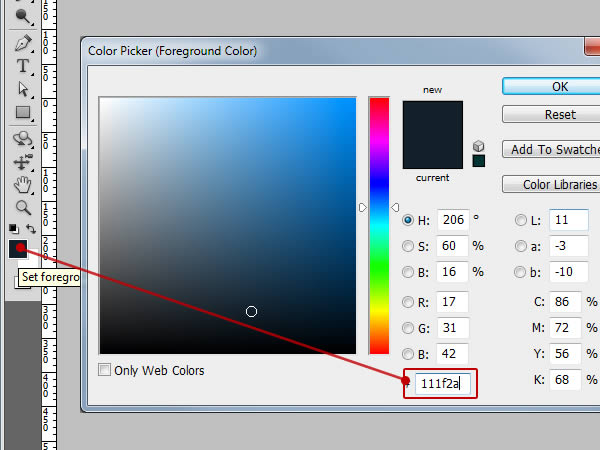
Making Background. First we need to change our background color. Change your foreground color to #111F2A as seen on picture below. Then easily hit Alt+Delete to and your background should be changed to that color now.

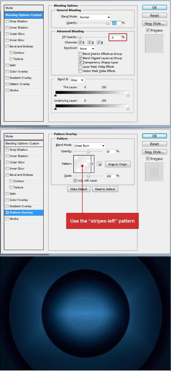
Now make a layer from the background by right clicking it in layer menu and choose “Layer from Background” option. Next go to Menu > Layer > Layer Style > Blending Options and use the settings below. you can also access Blending Options with two faster ways. First and the fastest way is to double click on the layer in your layers menu. Other way is to right click on the layer in your layers menu and choose Blending Options. When you are done with all the settings below, don’t forget to hit “OK” in the Blending Options window!
For the final background effect duplicate the background layer. you can do this by right clicking on the layer in layer menu and choose “Duplicate layer” from options. We will apply only pattern on this duplicated layer so first we clear the previous style on this duplicated layer by going to Menu > Layer > Layer Style > Clear Layer Style then we start a new one by going to Menu > Layer > Layer Style > Blending Options and use the settings below. you can also access Blending Options with two faster ways. First and the fastest way is to double click on the layer in your layers menu. Other way is to right click on the layer in your layers menu and choose Blending Options. When you are done with all the settings below, don’t forget to hit “OK” in the Blending Options window!
This duplicated layer must be above the original background layer in your layer menu.
Step 3

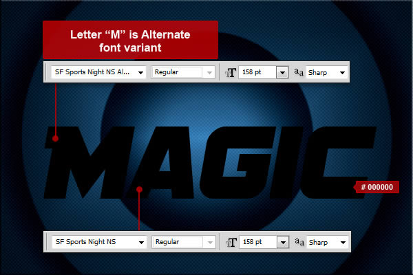
Start creating text – MAGIC. Now we can start making our first text effect. First choose a type tool and change font to SF Sports Night NS, size around 158 pt and anti-aliasing Sharp. Now type your text somewhere in the center of the image. you can write any word, but in this tutorial I’ll use "MAGIC". As you can see I’ve used Alternate variant of the same font for letter "M". It is the SF Sports Night NS Alternate.
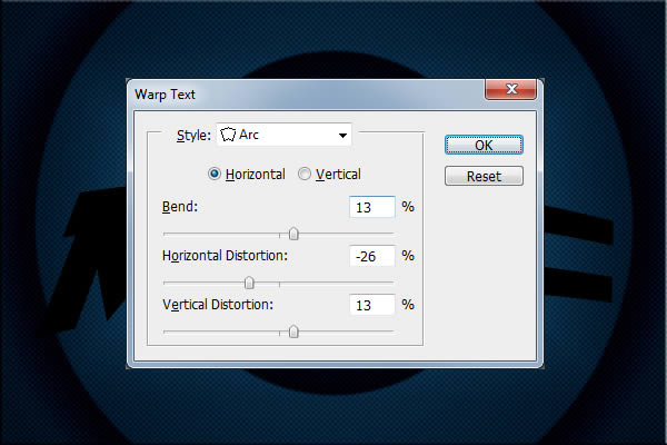
We will now continue with warping our text. Go to Menu > Edit > Transform > Warp and use settings from the picture below.

Step 4

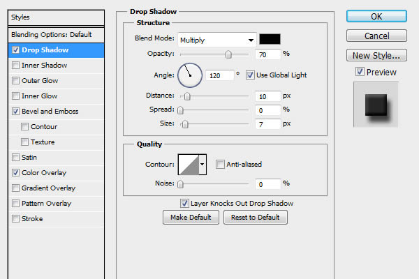
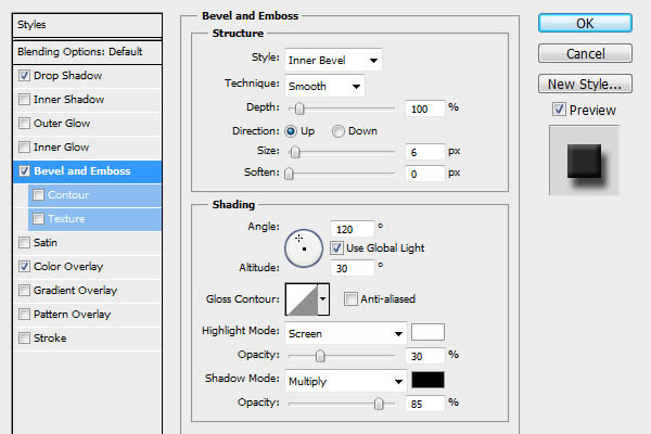
Customizing 1st text layer in MAGIC word. Finally we are ready to start with our text style. Go to Menu > Layer > Layer Style > Blending Options and use the settings below on our text. you can also use the quicker methods to access Blending Options from “Step 2″ of this tutorial. When you are done with all the settings below, don’t forget to hit “OK” in the Blending Options window! This text layer will add some shadows into the final result.
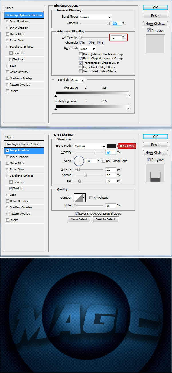
Step 5

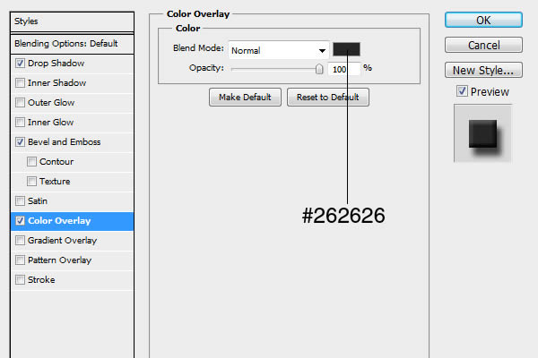
Customizing 2st text layer in MAGIC word. Now duplicate our “MAGIC” text layer so the duplicated layer will be above the original one. First we clear the previous style on this duplicated layer by going to Menu > Layer > Layer Style > Clear Layer Style then we start a new one by going to Menu > Layer > Layer Style > Blending Options and using the settings below on our text. you can also use the quicker methods to access Blending Options from “Step 2″ of this tutorial. When you are done with all the settings below, don’t forget to hit “OK” in the Blending Options window! This text layer will add the main text effect into the final result.


Step 6

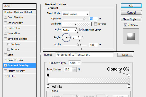
Customizing 3rd text layer in MAGIC word. Now duplicate our duplicated “MAGIC” text layer so this duplicated layer will be above the first duplicated one. First we clear the previous style on this duplicated layer by going to Menu > Layer > Layer Style > Clear Layer Style then we start a new one by going to Menu > Layer > Layer Style > Blending Options and using the settings below on our text. you can also use the quicker methods to access Blending Options from “Step 2″ of this tutorial. When you are done with all the settings below, don’t forget to hit “OK” in the Blending Options window! This text layer will add some more effects into the final result.
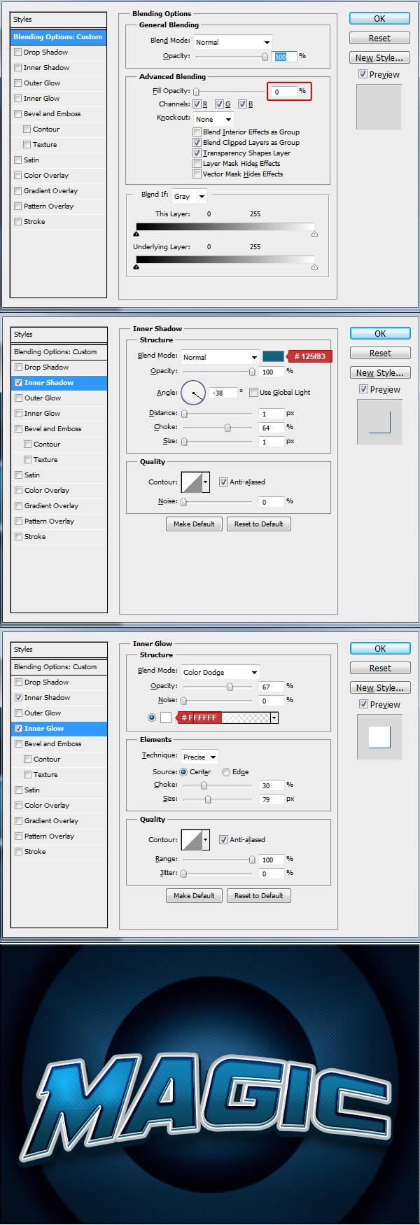

Step 7

Start creating text – SAN DIEGO. Now we can start making our next words with different text effect. First choose a type tool and choose again font SF Sports Night NS, size around 59 pt and anti-aliasing Sharp. Now type your text somewhere in the center of the image. you can write any words, but in this tutorial I’ll use "SAN DIEGO". As you can see I’ve used Alternate variant of the same font for letter "M". It is the SF Sports Night NS Alternate.
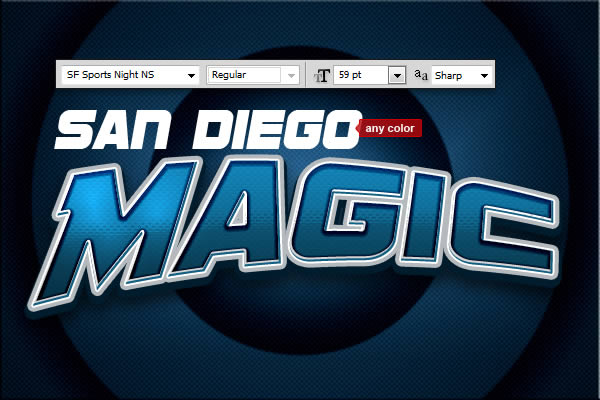
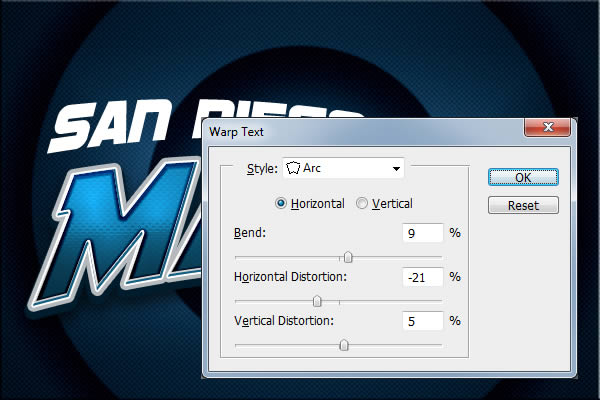
We will now continue with warping our text. Go to Menu > Edit > Transform > Warp and use settings from the picture below.

Step 8

Customizing 1st text layer in SAN DIEGO text. Finally we are ready to start with our text style. Go to Menu > Layer > Layer Style > Blending Options and use the settings below on our text. you can also use the quicker methods to access Blending Options from “Step 2″ of this tutorial. When you are done with all the settings below, don’t forget to hit “OK” in the Blending Options window! This text layer will add a shadow into the final result.
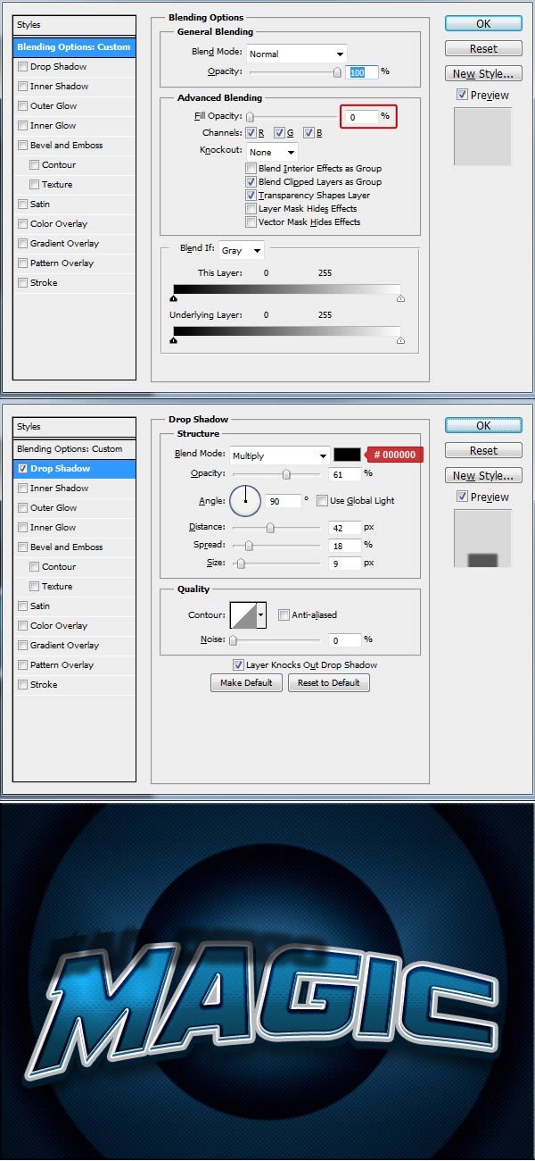
Step 9

Customizing 2st text layer in SAN DIEGO text. Now duplicate our “SAN DIEGO” text layer so the duplicated layer will be above the original one. First we clear the previous style on this duplicated layer by going to Menu > Layer > Layer Style > Clear Layer Style then we start a new one by going to Menu > Layer > Layer Style > Blending Options and using the settings below on our text. you can also use the quicker methods to access Blending Options from “Step 2″ of this tutorial. When you are done with all the settings below, don’t forget to hit “OK” in the Blending Options window! This text layer will add the main text effect into the final result.

Step 10

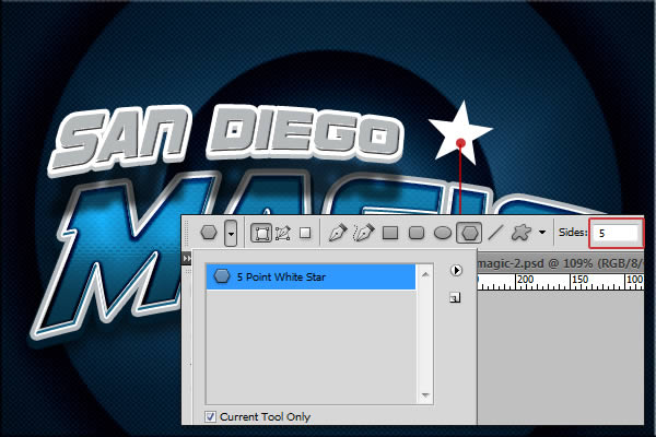
Creating Stars. To make a star, we will need to use a Polygon tool with selected 5 Point White Star as you can see on picture bellow. Draw only one star – we will duplicate the final star later.
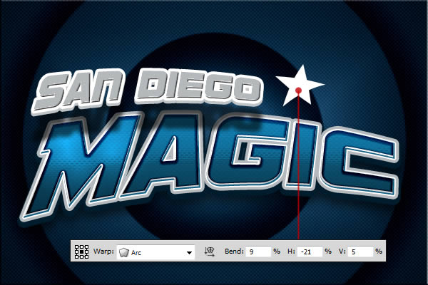
We will also continue with warping this shape. Go to Menu > Edit > Transform > Warp and use settings from the picture below.

Step 11

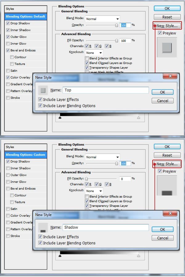
As You can see the style of the stars on final result is the same as on the SAN DIEGO text. We don’t need to customize styles again as we can save those from SAN DIEGO and simply use them on stars. How to do it? First we need to seva both styles used on SAN DIEGO text. Click on the top layer of SAN DIEGO text and go Menu > Layer > Layer Style > Blending Options. There hit the button "New Style…" on the right and check both options in a pop-up window. You can name your style and then hit OK. Do the same with the second layer of the SAN DIEGO text. In my example I named those styles TOP and SHADOW.
After you have saved both styles you can find them in your styles palette. If you can’t see your styles palette – go to Menu > Window > Styles to open it. Now select your "star" shape layer in your layer menu and click on the style "SHADOW" in your style menu to apply it on the shape. Now simply duplicate the "star" layer so the duplicated layer will be above the original one and use the "TOP" style on it.
Now you should see a final effect of the first star. To make another one – simply select both "star" layers (selecting multiple layers can be done with clicking on the first one and then clicking on the second one while holding the Ctrl or Cmd key) and go Menu > Layer > Duplicate Layers. Move both new created layers right and scale them both down a little bit. You will also need to rotate both layers so it will look like on my final image. I have rotated both around 6 degrees.
Do the same as above for the third star, but this time rotate it around 9 degrees.
Step 12

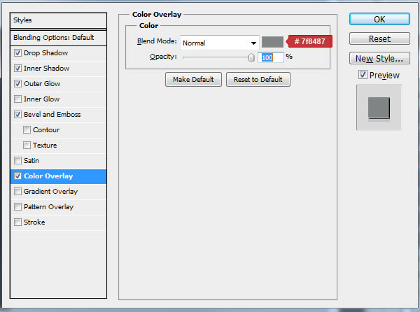
Optionally, you can recolor the first star to be darker as in my tutorial. This can be done by selecting the TOP layer of the first star shape and going to Menu > Layer > Layer Style > Blending Options where you can change color overlay.
Final Image


more »

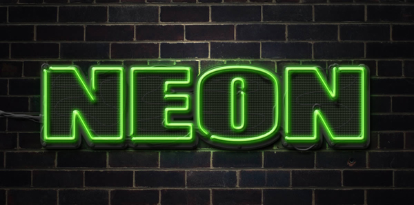
Create a Neon Text Effect in Photoshop

by Infamous_son

Final Product What You'll Be Creating

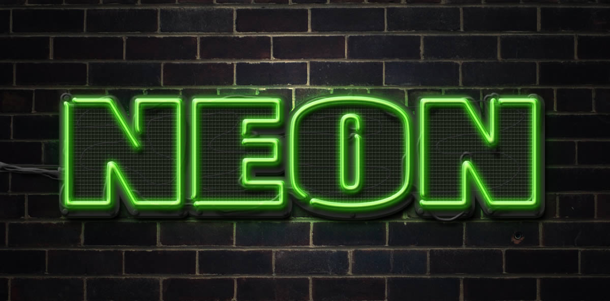
In this tutorial we will show you how to make a neon text effect in Photoshop using layer styles and textures.
Let’s get started!


Tutorial Assets

The following assets were used during the production of this tutorial.

Step 1

First make a new PSD document 1200 x 600 pixels resolution 72 Dpi. Now open the brick wall texture and copy and paste it into your new PSD document. Command/Ctrl-T (transform) the texture and resize it until you are happy with it. Make the brick wall texture darker with levels – Image – Adjustments – Levels or Command/Ctrl – L.

Step 2

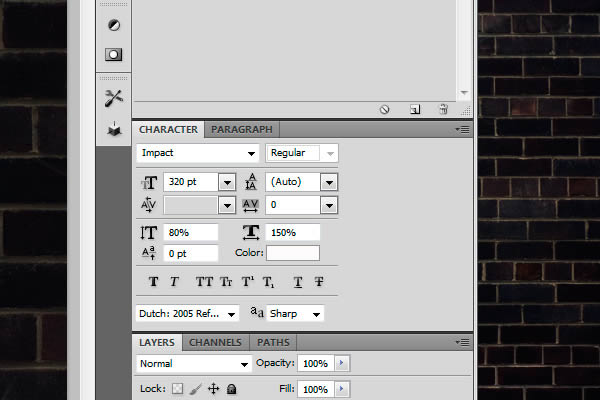
Now make your text with the font "Impact." I used the settings below.

Step 3

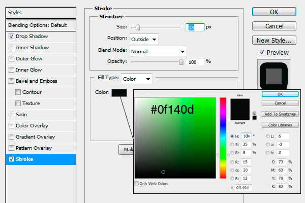
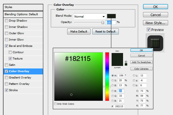
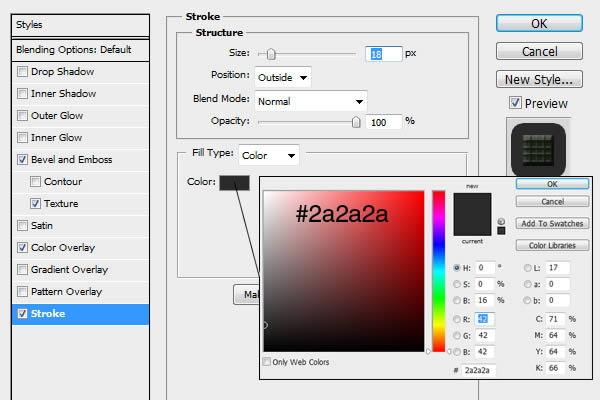
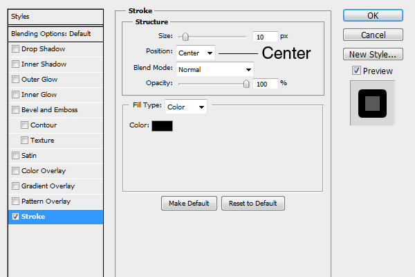
Now we are going to apply some layer styles. Double Click on the text layer to open Layer Styles. Select Stroke and use the settings below.
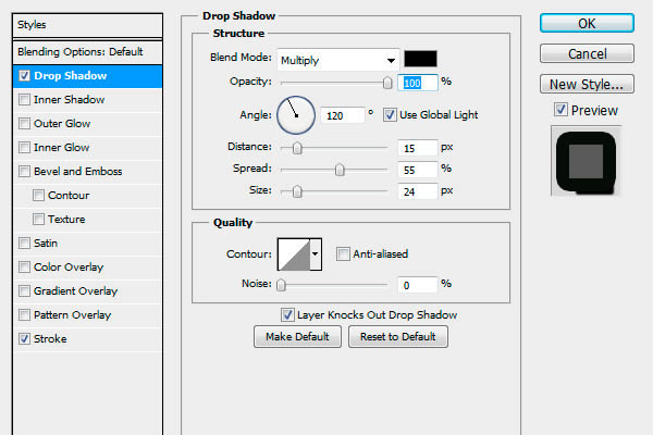
Now select Drop Shadow

Step 4

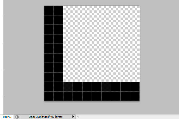
Now we are going to make the grill texture. Make a new document 10 x 10 pixels 72 Dpi. Enlarge the document to 3200% by pressing Command/Ctrl – +. Use a hard brush size 1 px to make 2 lines of black like below. Now save this pattern by going to "Edit – Define Pattern" and name it Grill Pattern. Close this document.

Step 5

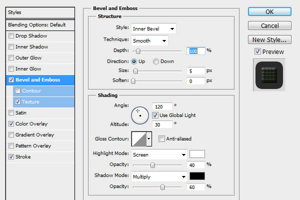
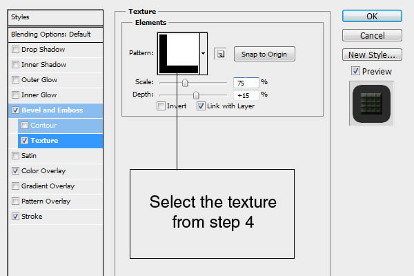
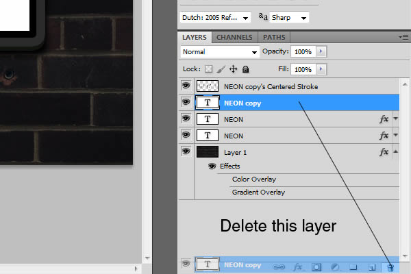
Copy the text layer, right click on the text layer and choose "Duplicate Layer." Now remove the layer styles on this layer by right click on the layer and choose "Clear Layer Styles." Double Click on the text layer to open Layer Styles. Use the settings below.

Step 6

For the little 3D effect on the text move the second text layer 5x up with the arrows on your keyboard with the Move Tool (v) selected.

Step 7

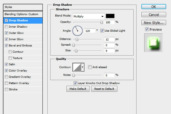
Now we are going to make the neon. Again copy the text layer, right click on the text layer and choose "Duplicate Layer." Now remove the layer styles on this layer by right click on the layer and choose "Clear Layer Styles." Use the settings below.
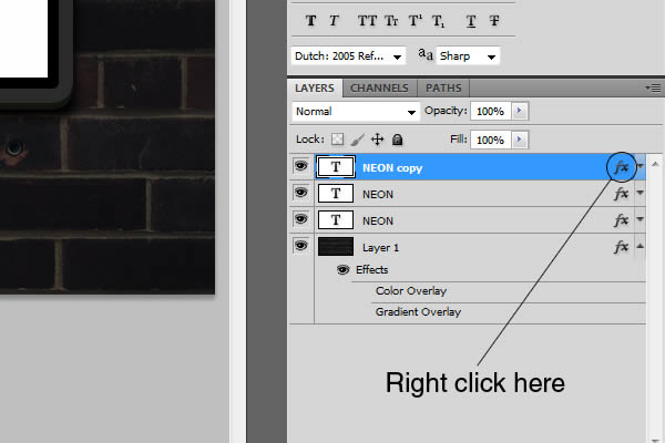
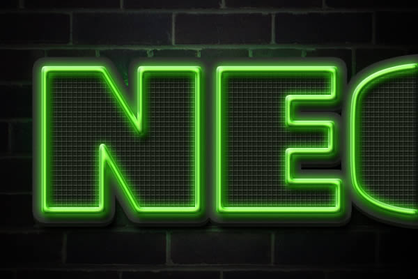
Click on OK. Right click on the "fx" of this text layer and choose "Create Layer"

Step 8

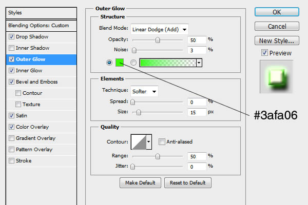
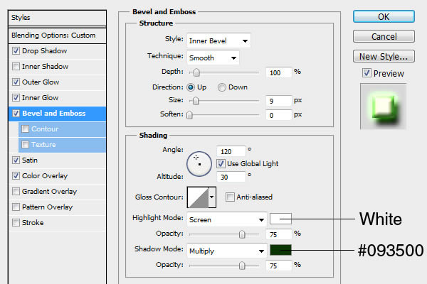
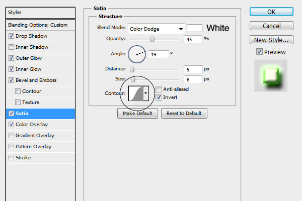
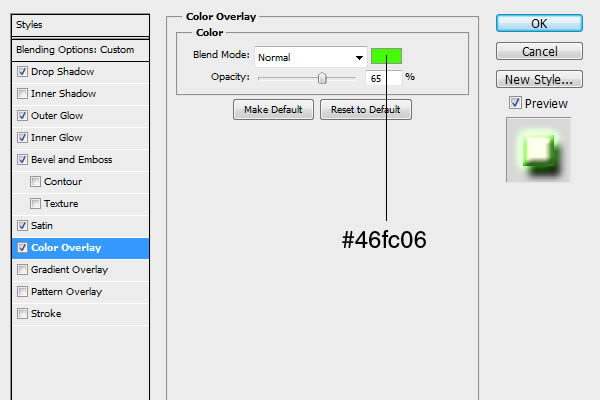
Now we are going to make the layer styles for the neon on the layer we just made. Use the settings below.

Step 9

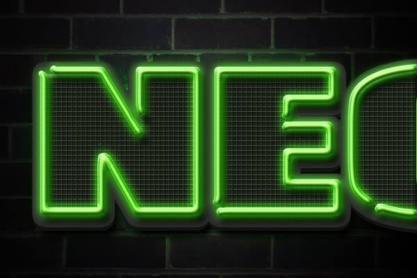
Select the "Eraser Tool" (e) and erase some parts from the neon for a realistic look. You can also draw on this layer with a hard Brush for some curves.

Step 10

You can draw some wires if you like. Make a new layer (put this layer below the neon layer). Use a hard brush size 7 and size 4 to draw the wires. Use the setting below

Step 10

Put a gradient fill on the background. Double click on the brick wall layer and use the settings below

Final Image

more »

Create a Shiny, Gold, Old World Text Effect in Photoshop

by Infamous_son

Final Product What You'll Be Creating


Step 1

First prepare your assets. Install the Pieces of Eight font onto your computer and open both .PAT files. Finally open the "background-img.jpg" which is 600×400 px and will be your workspace.


Step 2

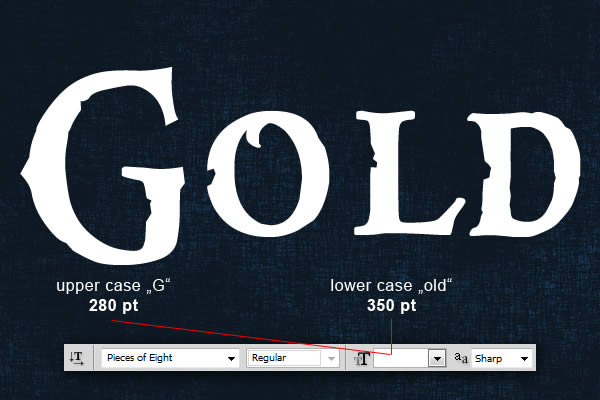
Now we can start making our first text effect. First choose the type tool and change font to Pieces of Eight, size should be around 280 pt for letter "G" and around 350 pt for the rest of letters with anti-aliasing set to Sharp as seen on picture below. Now type your text somewhere in the center of the image. You can write any word, but in this tutorial I’ll use "Gold".


Step 3

We are ready to start with our text style. Go to Menu > Layer > Layer Style > Blending Options and use the settings below. You can also access Blending Options with two faster ways. First and the fastest way is to double click on the layer in your layers menu. Other way is to right click on the layer in your layers menu and choose Blending Options. When you are done with all the settings below, don’t forget to hit "OK" in the Blending Options window! This text layer will add the main gold text effects into the final result.


Step 4

Now duplicate our "Gold" text layer so the duplicated layer will be above the original one. First we clear the previous style on this duplicated layer by going to Menu > Layer > Layer Style > Clear Layer Style then we start a new one by going to Menu > Layer > Layer Style > Blending Options and using the settings below on our text. You can also use the quicker methods to access Blending Options from "Step 3" of this tutorial. When you are done with all the settings below, don’t forget to hit "OK" in the Blending Options window! This text layer will add the depth into the final result.
If you are happy with this result, you can be done with this tutorial, but in next steps I will add more flare to the final effect.


Step 5

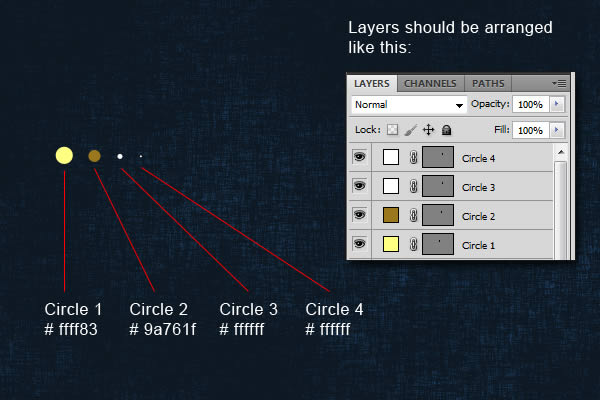
Now we will create lighting dots. We start with one and will duplicate as many as we will need. So for now, you can hide both text layers to have clear workspace. Choose the "Ellipse Tool" and draw 4 circles around the same diameter, color and layer arrangement as on the picture below. You should also rename the layers to Circle 1, Circle 2, etc., as I will use it names in next steps.


Step 6

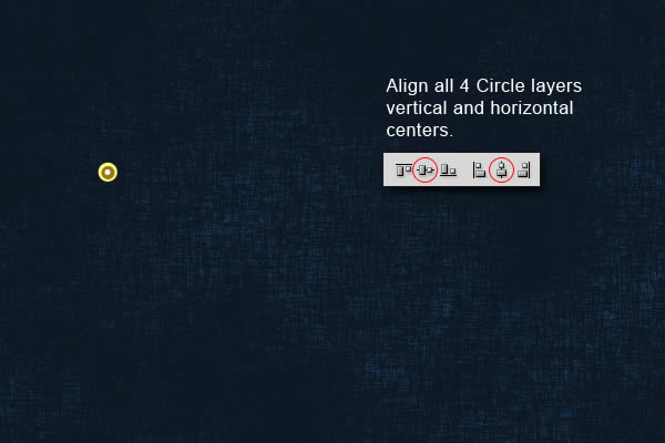
When you are done creating the circles, use vertical and horizontal centers alignment.


Step 7

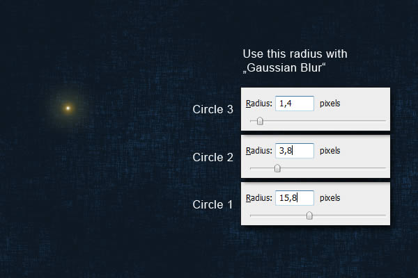
Next step is to add “Gaussian Blur” to circles 1,2 and 3. Select the “Circle 1″ layer and go MENU > Filter > Blur > Gaussian Blur and use the Radius settings from the picture below. Repeat it for Circle 2 and 3, but with different Radius setting.


Step 8

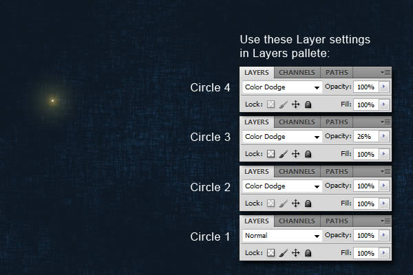
When you are done with blur, we will be doing some layer settings. Use the same layer settings as on the picture below.


Step 9

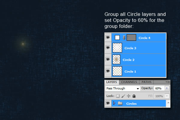
Final step in creating lighting dot is to group all 4 circle layers and set the Opacity of the Circles folder to 60%.

Step 10

This is the fun part of this tutorial. Make both text layers visible again and move the lighting dot on the edge of the text. Duplicate the whole "Circles" folder for more dots and spread it through the whole text. On the picture below you can see the positions I used in this tutorial, but it is up to you where you want it to have them. You can see on my example that there are places which shine more then others. It is simply made by multiplying two "Circle" folders.

Final Image


more »